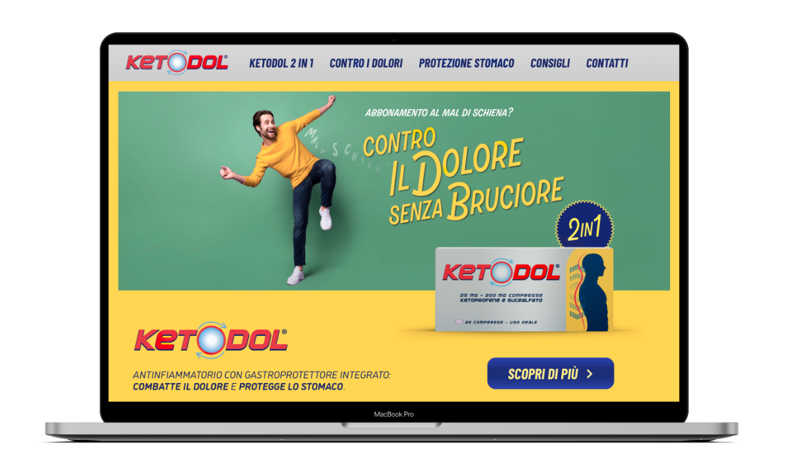
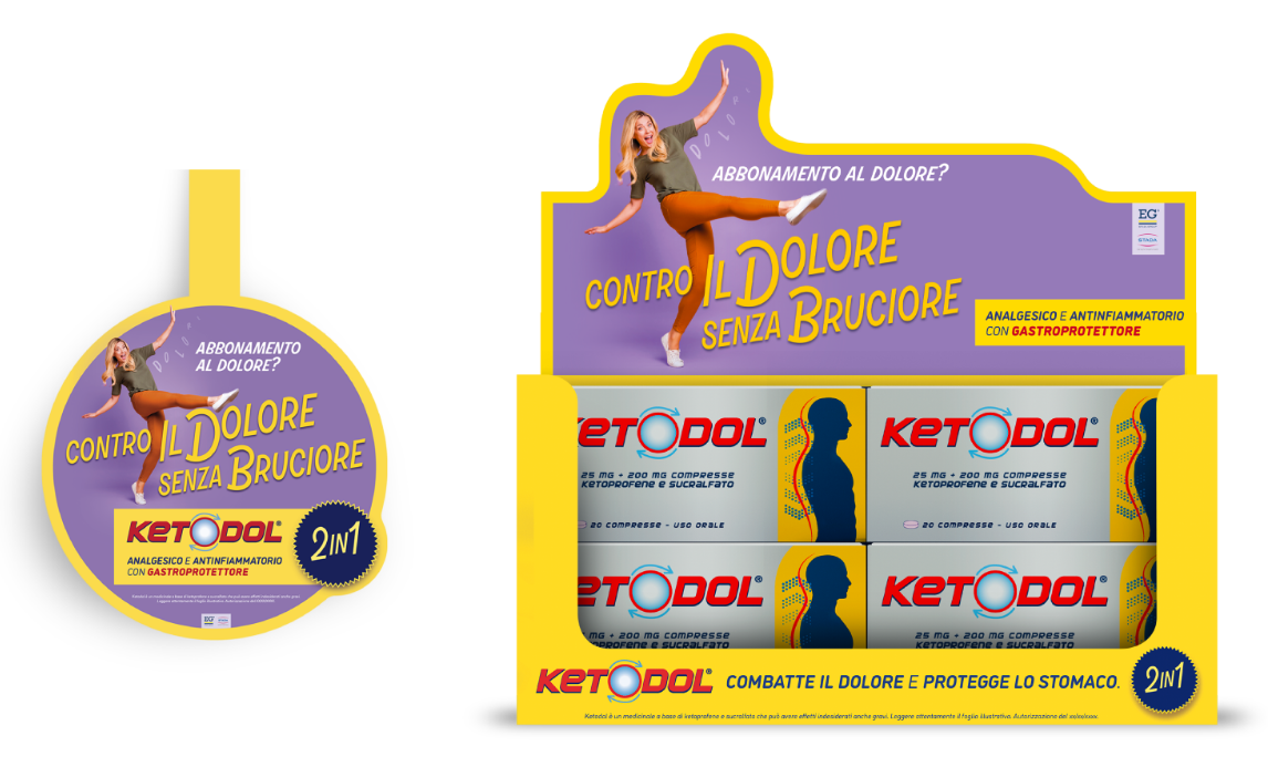
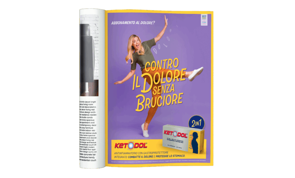
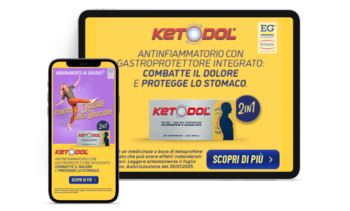
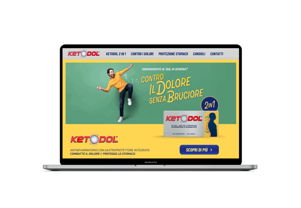
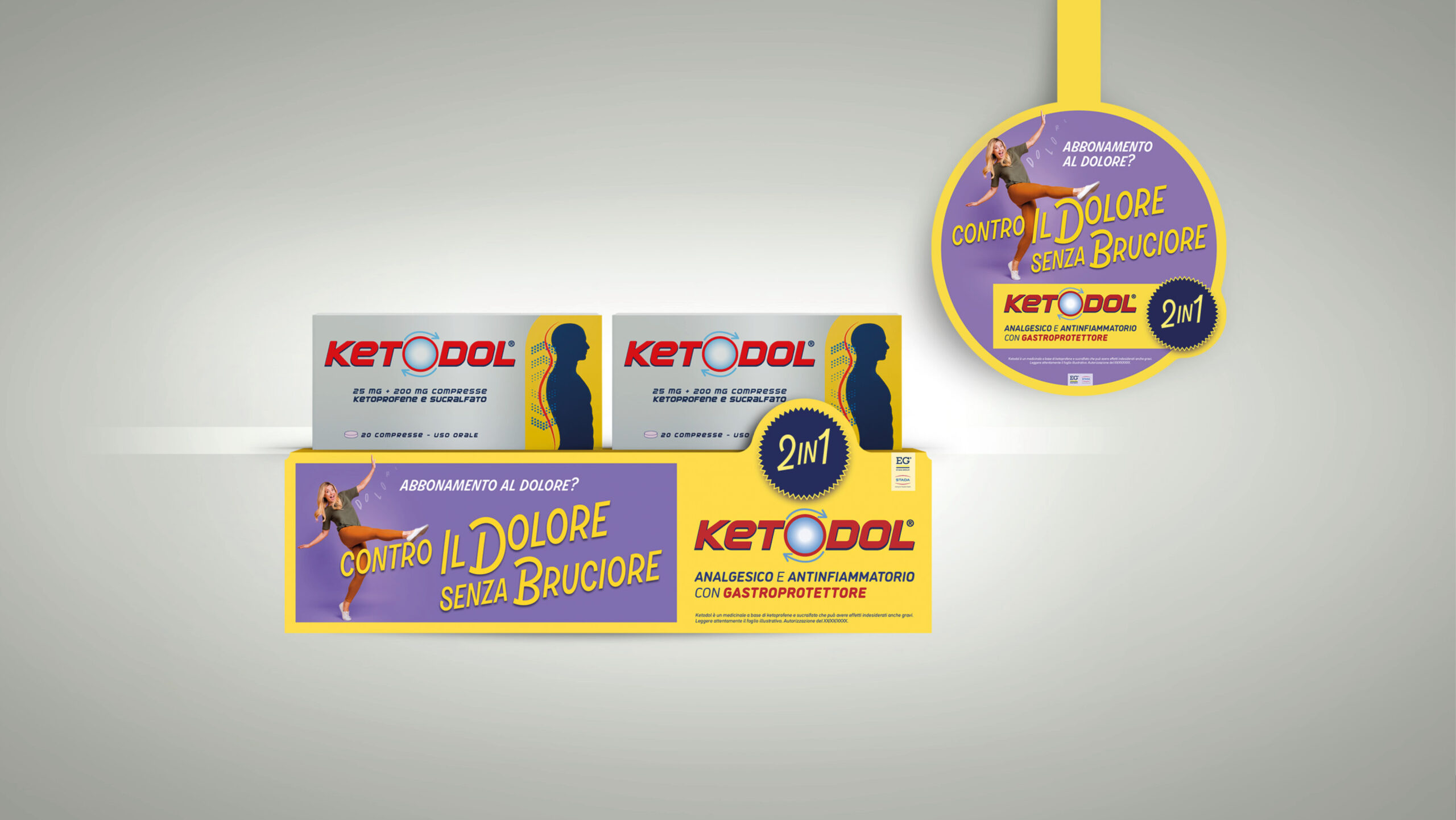
Ketodol voleva ampliare la sua target audience con un nuovo positioning nell’affollato mercato body pain.
La sfida era valorizzare l’unicità della formula, antinfiammatoria e gastroprotettiva insieme, rispettando le normative per la comunicazione dei farmaci.
strategy
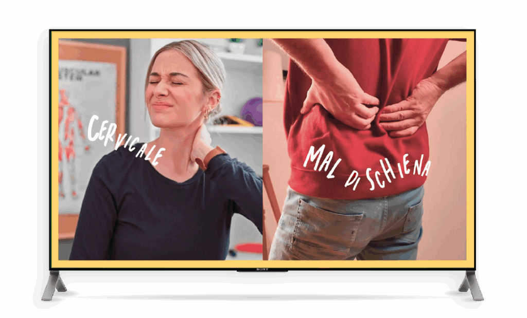
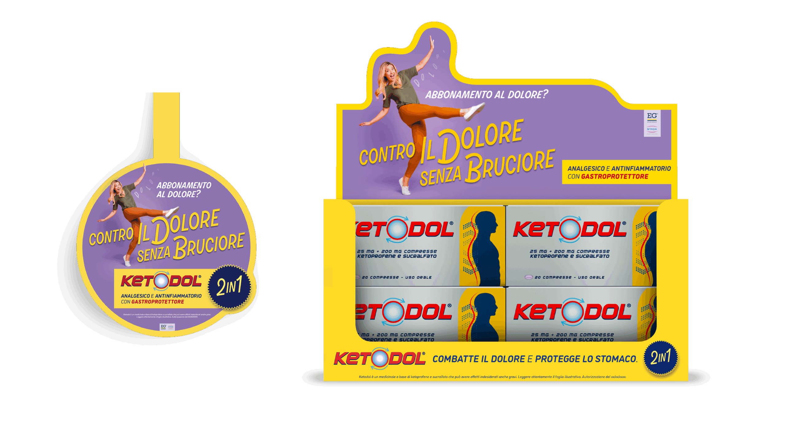
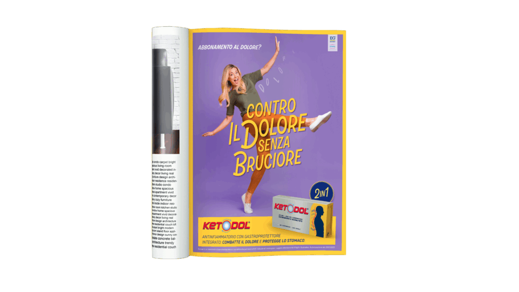
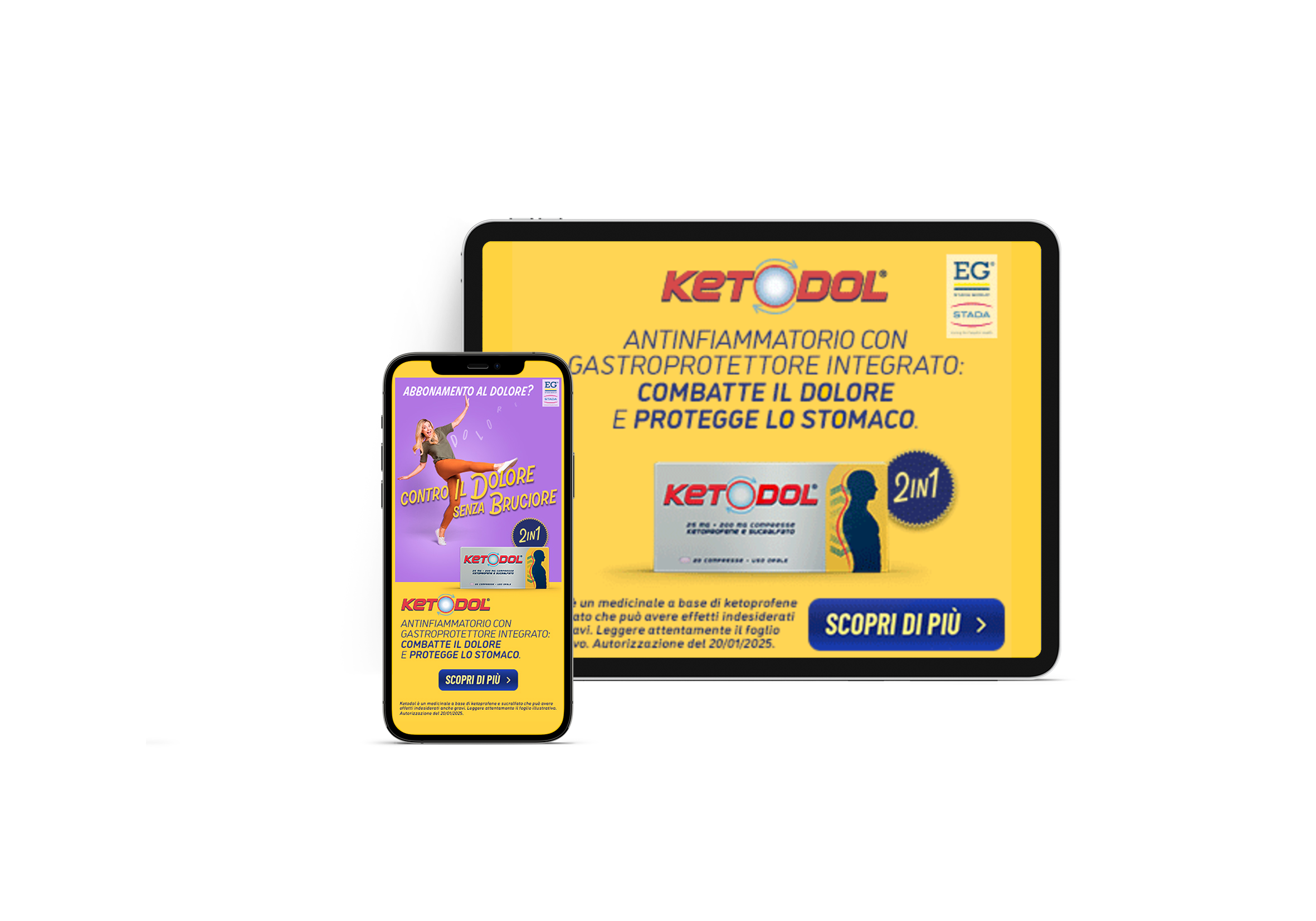
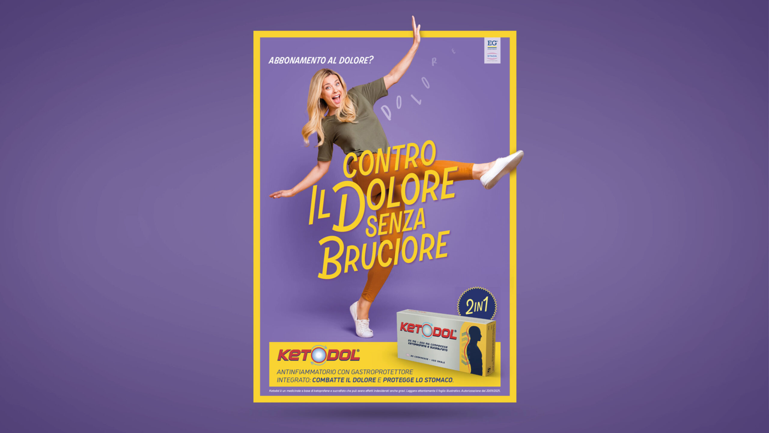
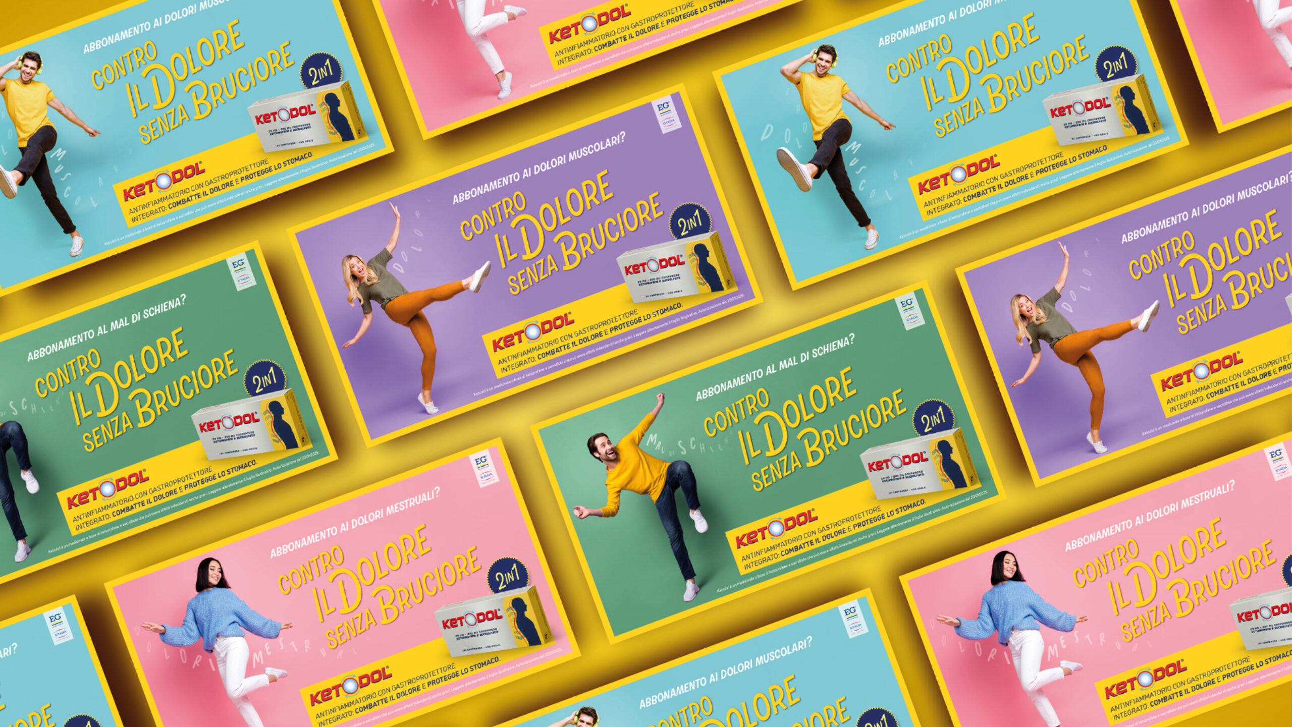
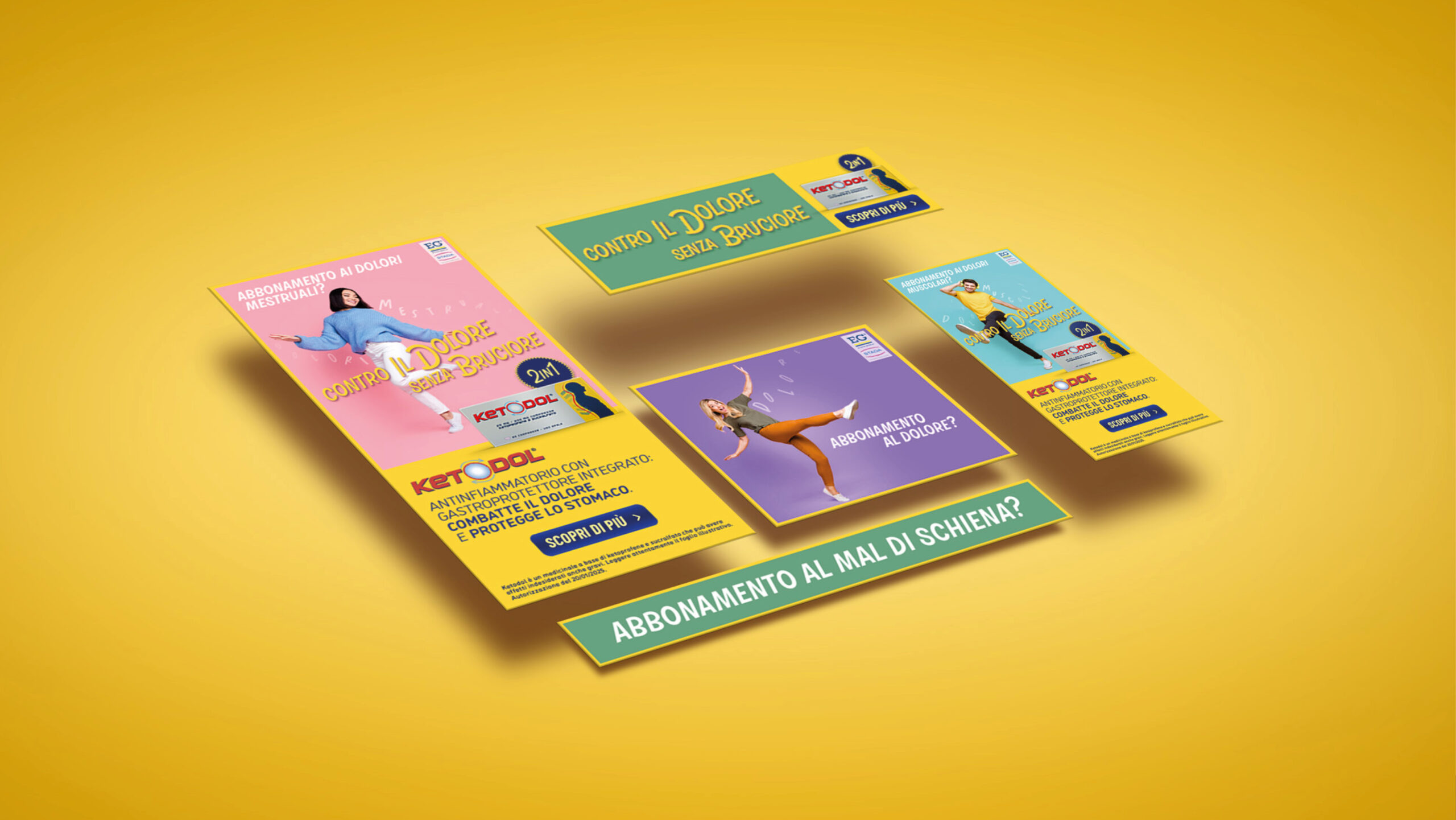
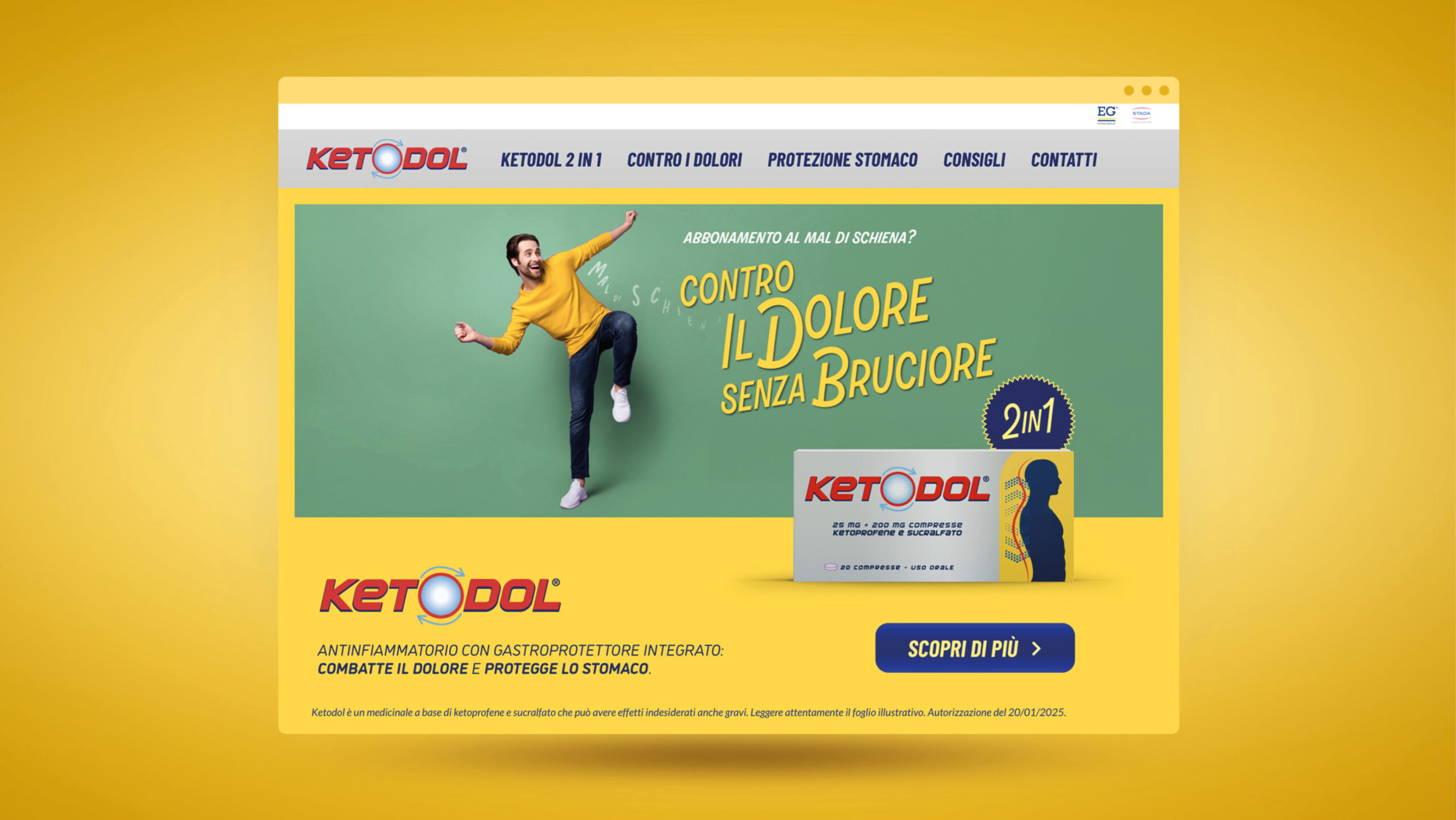
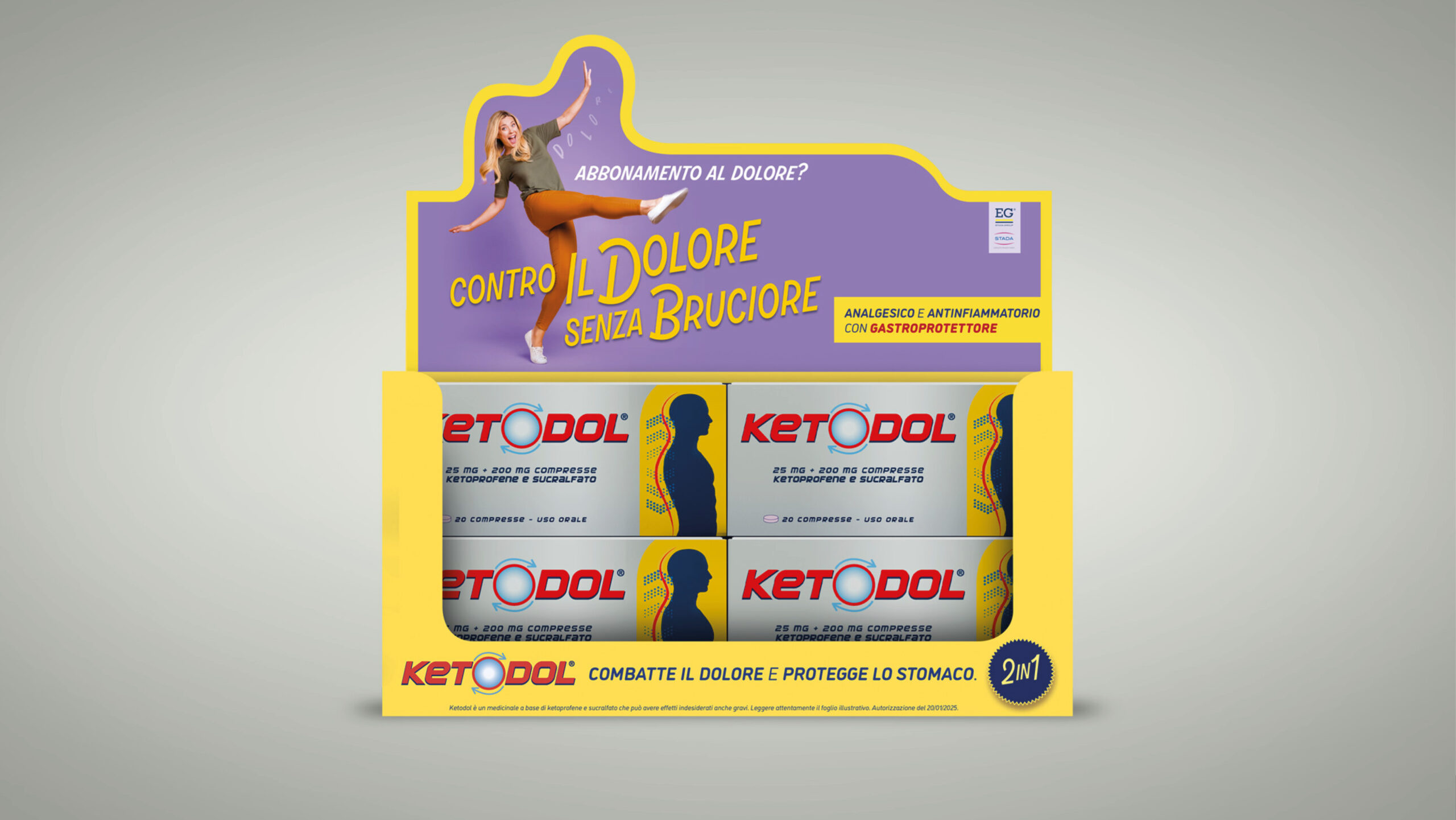
Con un focus totale sull’USP di prodotto, abbiamo deciso di enfatizzare il concetto di “2 in 1” in ogni aspetto creativo, addirittura con un sound logo composto ad hoc, e di parlare a target specifici, con particolare attenzione per chi soffre di dolori cronici ed è “abbonato al dolore”.
Un claim memorabile, “Contro il dolore, senza bruciore”, associato a una campagna “multi-target, multi-pain” che rappresenta i potenziali users in modo positivo, colorato e accattivante, ci ha permesso di comunicare al meglio il valore del doppio end-benefit offerto da Ketodol.
Ketodol set out to expand its target audience with a fresh positioning in the crowded body pain market. The challenge was to highlight the formula’s unique dual action—anti-inflammatory and gastroprotective—while staying fully compliant with pharmaceutical communication regulations.
strategy
With a sharp focus on the product’s USP, we chose to highlight the “2-in-1” concept across every creative asset—even crafting a custom sound logo to reinforce it. We spoke directly to specific targets, with particular attention to those living with chronic pain—those who feel “subscribed to suffering.”
The memorable claim, “Against pain, without the burn,” was paired with a vibrant, multi-target, multi-pain campaign that portrayed potential users in a positive, colorful, and engaging way. This approach allowed us to clearly communicate the dual end-benefit of Ketodol: powerful relief and gastroprotection.
Lead Generation campaigns; content creation and planning strategies on Google, Facebook and Instagram; content creation and planning of Direct Mail Marketing campaigns; SEM and SEO optimization. Whatever conversion you are looking for, we’re at your side in creating and implementing the funnel necessary to get the results you need, measurable and concrete.
The paradox of shopping online is that anyone can see your products, but no-one can actually touch them before buying. This is why, your e-commerce must show your products off to their very best and in a reliable way, with SEO friendly contents which make you easy to find, appealing images and texts which accompanies the user down the purchasing funnel and distinctive design everywhere. All of this starts from an in-depth study of the competitors, your positioning and your medium- and long-term objectives.
Designing effective web sites, mini-sites and landing pages means putting yourself in the user’s shoes and interpreting their browsing habits and needs: in other words, User Interface and User Experience design. Whether it is a launch or a restyling, we study an accurate and user-friendly look&feel so that your customers can find what they are looking for in the easiest, most intuitive and interesting way.
In the digital era, it is necessary to carve out a well-defined online space in order emerge in the vastness of the Net and converse with a pool of users never seen before. Social media marketing, online advertising, influencer strategy, social media management, monitoring analysis, creation of textual, photographic and video content are just some of the activities for to intercept and engage your target online.
First, we study the positioning on the reference market. Then, we proceed to develop the logo design, brand name, corporate image, catalogues and internal and external communication materials, merchandising, stands for events and fairs, and photoshoots: to create your brand identity, we focus on what makes you unique and make it unmistakable.
First, we study the positioning on the reference market. Then, we proceed to develop the logo design, brand name, corporate image, catalogues and internal and external communication materials, merchandising, stands for events and fairs, and photoshoots: to create your brand identity, we focus on what makes you unique and make it unmistakable.
Lead Generation campaigns; content creation and planning strategies on Google, Facebook and Instagram; content creation and planning of Direct Mail Marketing campaigns; SEM and SEO optimization. Whatever conversion you are looking for, we’re at your side in creating and implementing the funnel necessary to get the results you need, measurable and concrete.
The paradox of shopping online is that anyone can see your products, but no-one can actually touch them before buying. This is why, your e-commerce must show your products off to their very best and in a reliable way, with SEO friendly contents which make you easy to find, appealing images and texts which accompanies the user down the purchasing funnel and distinctive design everywhere. All of this starts from an in-depth study of the competitors, your positioning and your medium- and long-term objectives.
On the web, you have the opportunity to know the digital reputation of your brand, the behavior of consumers, and the reasons behind that behavior: a real treasure trove of information! For you, we can monitor hashtags, URLs, keywords and help you better understand the market, the target and your competitors’ positioning in order to develop the most functional marketing strategy for your business.
On the web, you have the opportunity to know the digital reputation of your brand, the behavior of consumers, and the reasons behind that behavior: a real treasure trove of information! For you, we can monitor hashtags, URLs, keywords and help you better understand the market, the target and your competitors’ positioning in order to develop the most functional marketing strategy for your business.
Our advertising campaigns are always a balance of originality, aesthetic impact and extreme clarity: we stay firmly focused on the messages you want to communicate and we transform them into press releases, outdoor billboards, signage, poster, video or radio adverts. Every creativity is developed with a multi-channel perspective so as to optimize the use of your budget.
Our advertising campaigns are always a balance of originality, aesthetic impact and extreme clarity: we stay firmly focused on the messages you want to communicate and we transform them into press releases, outdoor billboards, signage, poster, video or radio adverts. Every creativity is developed with a multi-channel perspective so as to optimize the use of your budget.
With decades of experience in creating campaign concepts, scripts, and storyboards, in choosing locations, in the video direction, photography, and production of commercials and institutional videos, one thing is certain: every brand, project, or product has a story that is worth telling in a spectacular way. After all, videos are the most engaging media ever and remain unmatched for storytelling.
With decades of experience in creating campaign concepts, scripts, and storyboards, in choosing locations, in the video direction, photography, and production of commercials and institutional videos, one thing is certain: every brand, project, or product has a story that is worth telling in a spectacular way. After all, videos are the most engaging media ever and remain unmatched for storytelling.
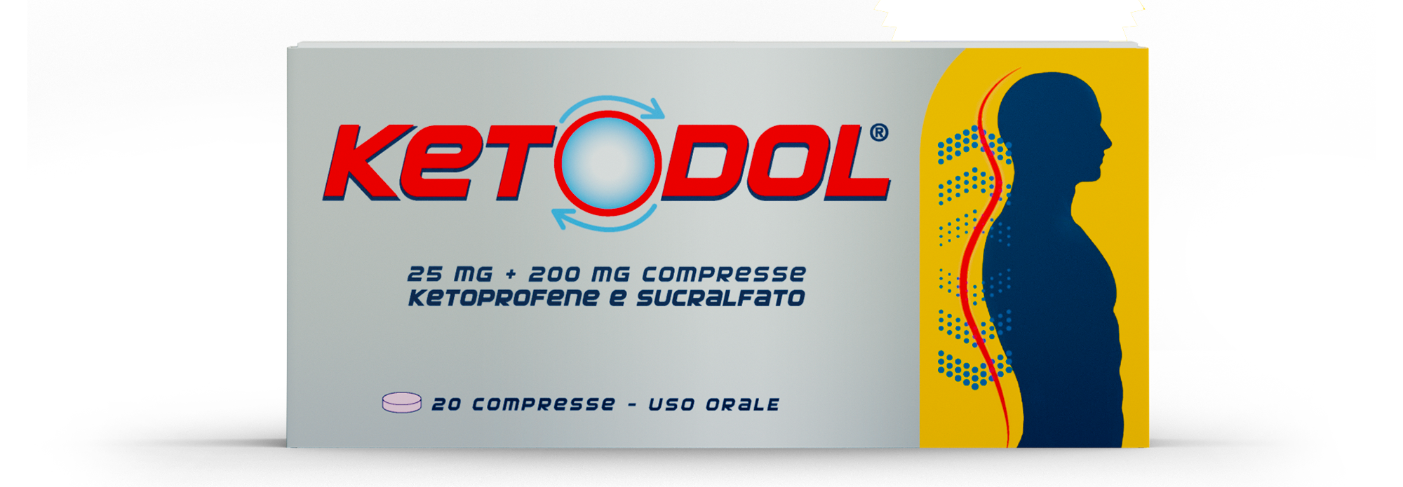
The packaging must communicate the uniqueness and quality of your products, it must make them understandable and attractive for consumers who don’t know them, recognizable for those who have already chosen them once and want to do so again. When we develop the logo, the brand name, the front panel for the launch or restyling of a product, we know that this is what it takes to make it stand out on the shelf.
The packaging must communicate the uniqueness and quality of your products, it must make them understandable and attractive for consumers who don’t know them, recognizable for those who have already chosen them once and want to do so again. When we develop the logo, the brand name, the front panel for the launch or restyling of a product, we know that this is what it takes to make it stand out on the shelf.
Emerging in the in-store arena is a really tough challenge, but with thoughtful design, combined with original and carefully crafted messages and point-of-purchase materials – such as window signs, countertop and floor displays, reglette, leaflets and consumer information folders – you can find yourself at the center of your potential customers’ attention.
Emerging in the in-store arena is a really tough challenge, but with thoughtful design, combined with original and carefully crafted messages and point-of-purchase materials – such as window signs, countertop and floor displays, reglette, leaflets and consumer information folders – you can find yourself at the center of your potential customers’ attention.