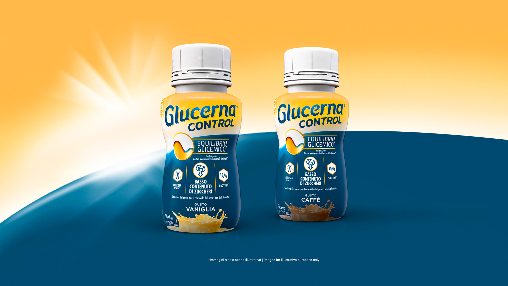
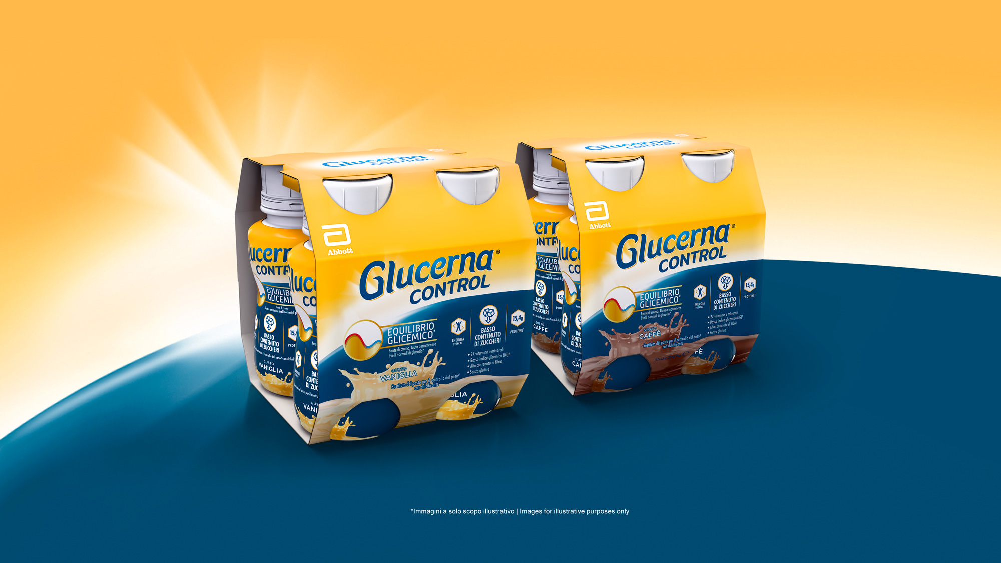
Glucerna is a long-standing brand in nutritional support. With the European launch of its ready-to-drink meal replacement for weight control, the Abbott team relied on our expertise in packaging design to develop single-unit and 4-pack packaging. The goal? To make the product’s key benefits more visible, legible, and appealing to the end consumer.
The brief was clear: elevate the packaging by working on lettering, sub-brand, visual elements, colors, and layout to improve appeal and shelf presence, while also simplifying and organizing content to rebalance messaging priorities. The ultimate goal was to reinforce Glucerna Control’s positioning as a conscious and modern choice for daily blood sugar management.
The result is a completely revamped, contemporary, functional, and eye-catching packaging system. The “Glucose Control” symbol became the visual centerpiece of the design, reimagined from top to bottom with fresh colors and intuitive icons for nutritional information—making it easier to interpret quickly, even in a crowded retail environment.
A pack designed to be carried and consumed anywhere with confidence, projecting the goodness of what’s inside at first glance, and giving consumers a renewed sense of control over their well-being.
International Benchmark
Concept strategy
Logo and sub-brand design
Visual design of the “Glucose Control” icon
Art direction
Copywriting
Multi-country adaptation in compliance with regulatory guidelines
Lead Generation campaigns; content creation and planning strategies on Google, Facebook and Instagram; content creation and planning of Direct Mail Marketing campaigns; SEM and SEO optimization. Whatever conversion you are looking for, we’re at your side in creating and implementing the funnel necessary to get the results you need, measurable and concrete.
The paradox of shopping online is that anyone can see your products, but no-one can actually touch them before buying. This is why, your e-commerce must show your products off to their very best and in a reliable way, with SEO friendly contents which make you easy to find, appealing images and texts which accompanies the user down the purchasing funnel and distinctive design everywhere. All of this starts from an in-depth study of the competitors, your positioning and your medium- and long-term objectives.
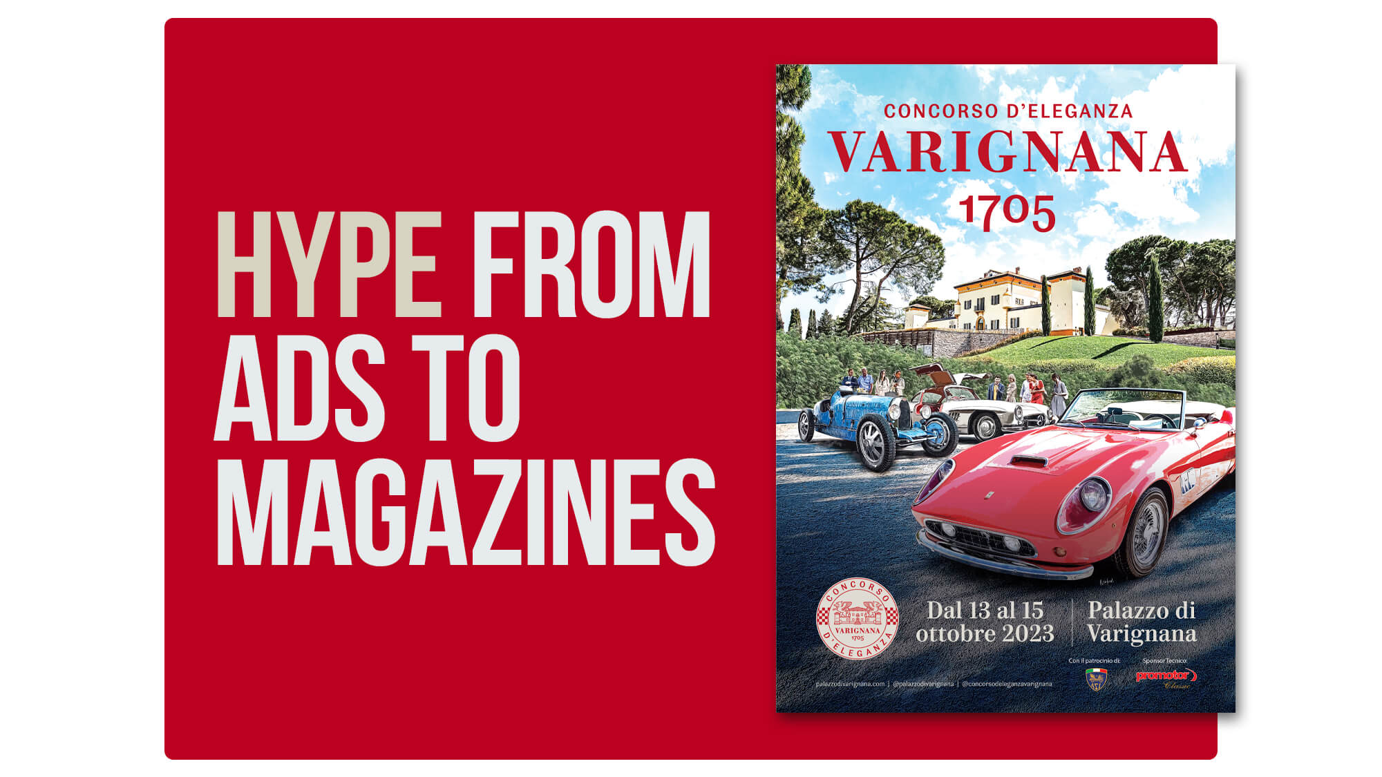
Our advertising campaigns are always a balance of originality, aesthetic impact and extreme clarity: we stay firmly focused on the messages you want to communicate and we transform them into press releases, outdoor billboards, signage, poster, video or radio adverts. Every creativity is developed with a multi-channel perspective so as to optimize the use of your budget.
Designing effective web sites, mini-sites and landing pages means putting yourself in the user’s shoes and interpreting their browsing habits and needs: in other words, User Interface and User Experience design. Whether it is a launch or a restyling, we study an accurate and user-friendly look&feel so that your customers can find what they are looking for in the easiest, most intuitive and interesting way.
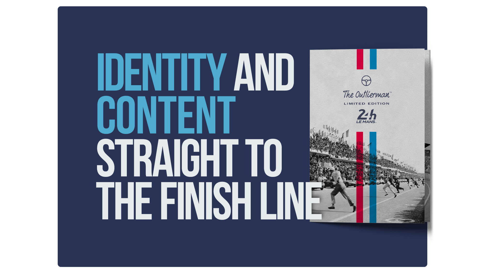
First, we study the positioning on the reference market. Then, we proceed to develop the logo design, brand name, corporate image, catalogues and internal and external communication materials, merchandising, stands for events and fairs, and photoshoots: to create your brand identity, we focus on what makes you unique and make it unmistakable.
In the digital era, it is necessary to carve out a well-defined online space in order emerge in the vastness of the Net and converse with a pool of users never seen before. Social media marketing, online advertising, influencer strategy, social media management, monitoring analysis, creation of textual, photographic and video content are just some of the activities for to intercept and engage your target online.
Designing effective web sites, mini-sites and landing pages means putting yourself in the user’s shoes and interpreting their browsing habits and needs: in other words, User Interface and User Experience design. Whether it is a launch or a restyling, we study an accurate and user-friendly look&feel so that your customers can find what they are looking for in the easiest, most intuitive and interesting way.
In the digital era, it is necessary to carve out a well-defined online space in order emerge in the vastness of the Net and converse with a pool of users never seen before. Social media marketing, online advertising, influencer strategy, social media management, monitoring analysis, creation of textual, photographic and video content are just some of the activities for to intercept and engage your target online.
First, we study the positioning on the reference market. Then, we proceed to develop the logo design, brand name, corporate image, catalogues and internal and external communication materials, merchandising, stands for events and fairs, and photoshoots: to create your brand identity, we focus on what makes you unique and make it unmistakable.
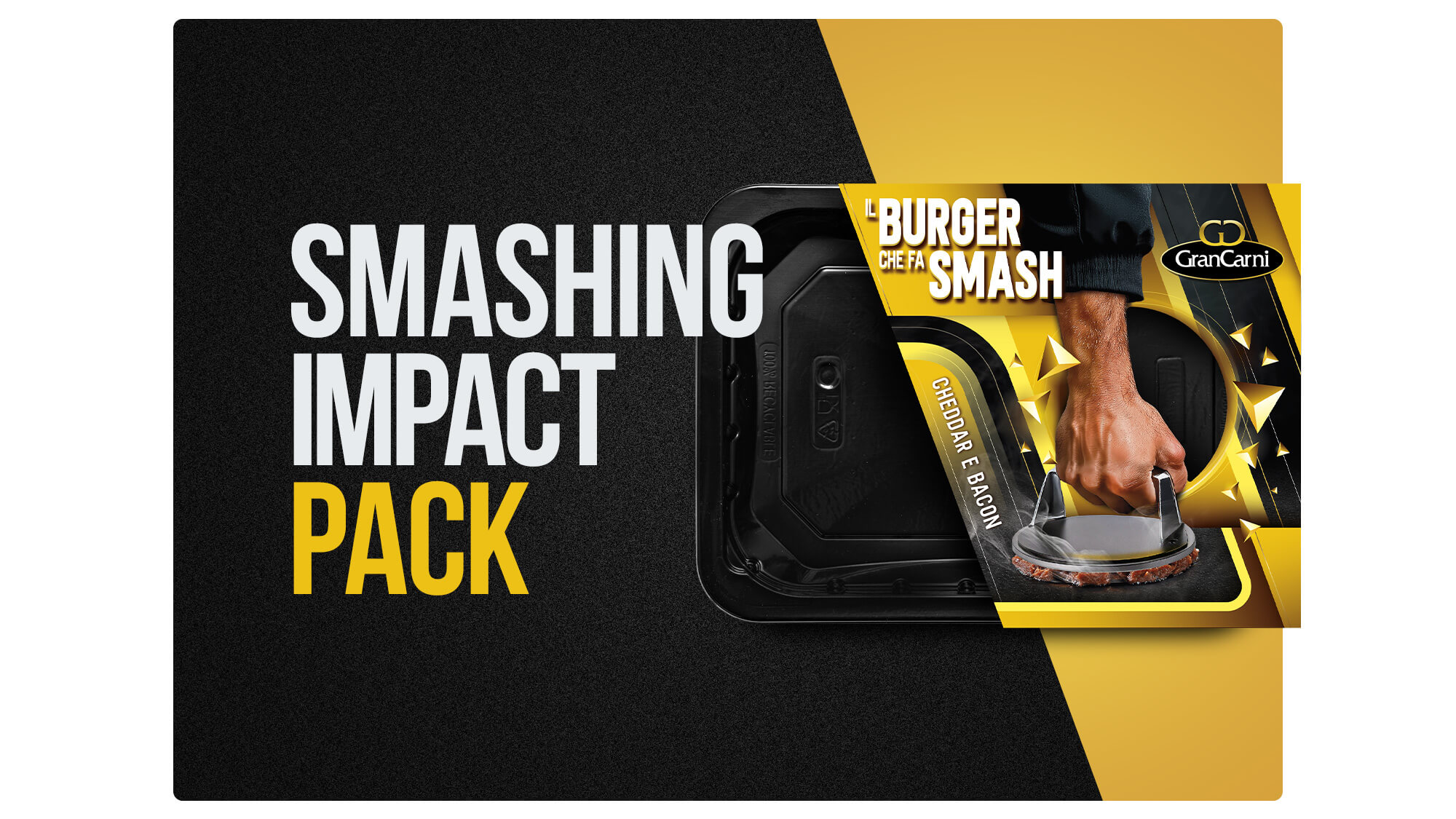
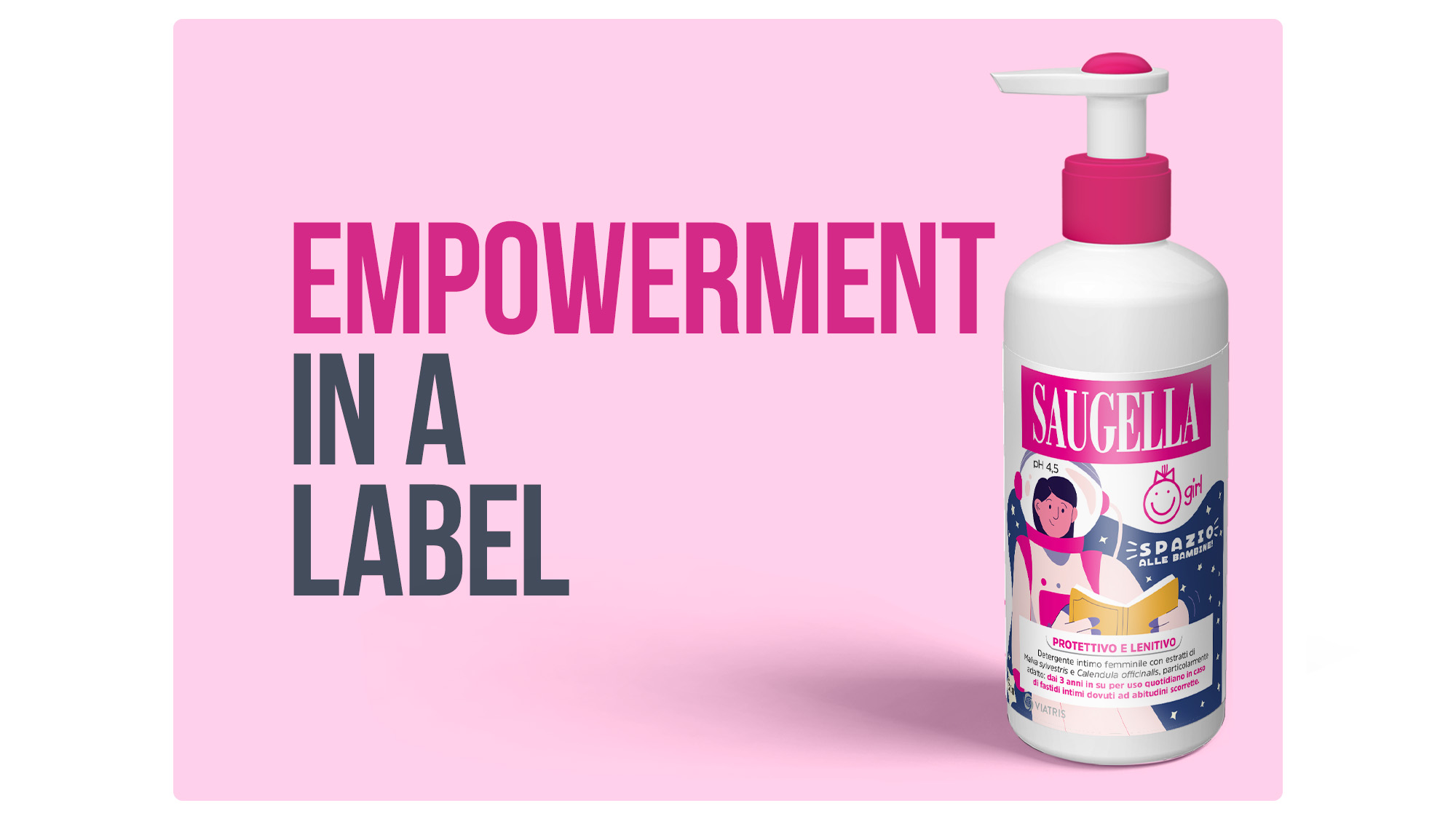
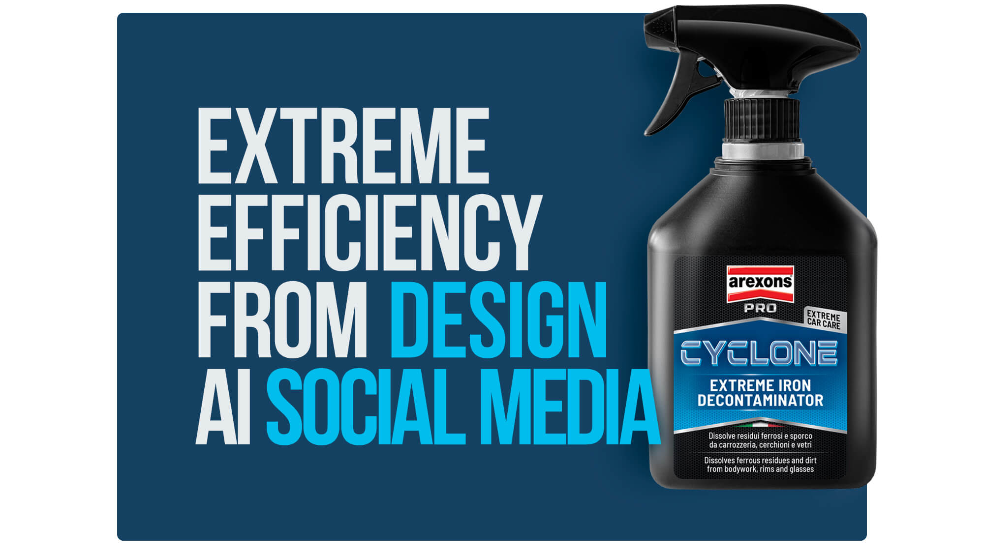
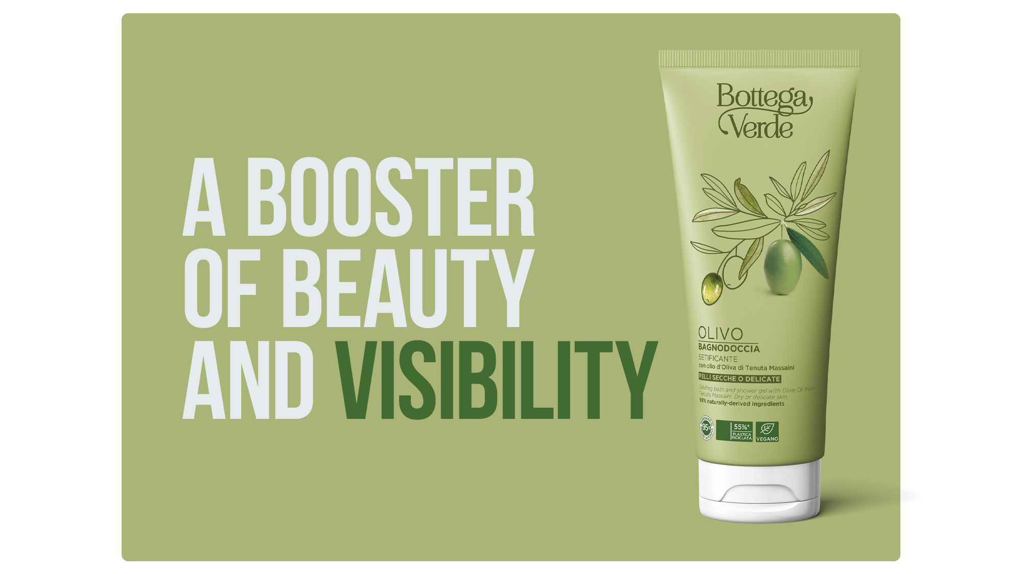
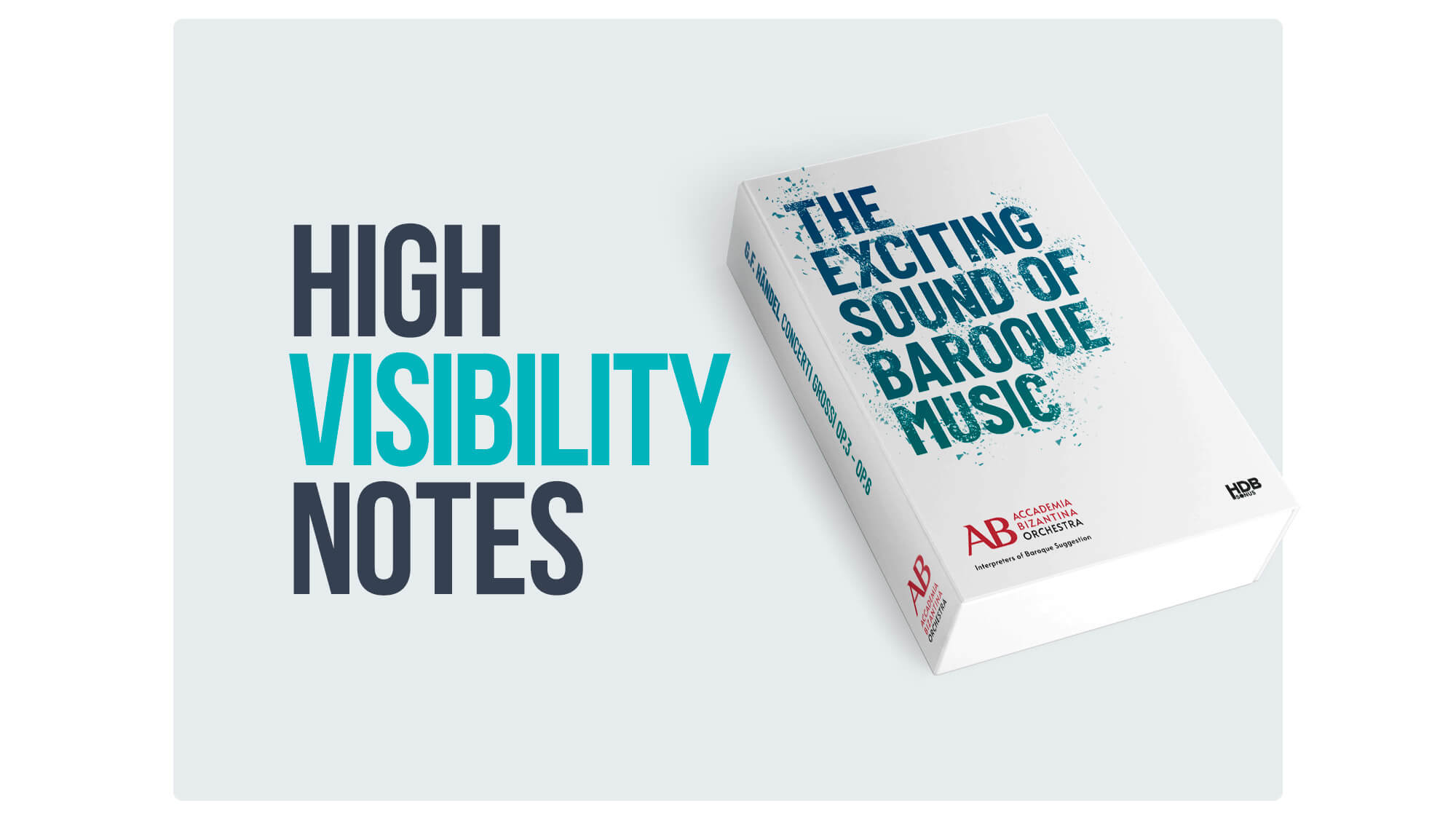
The packaging must communicate the uniqueness and quality of your products, it must make them understandable and attractive for consumers who don’t know them, recognizable for those who have already chosen them once and want to do so again. When we develop the logo, the brand name, the front panel for the launch or restyling of a product, we know that this is what it takes to make it stand out on the shelf.
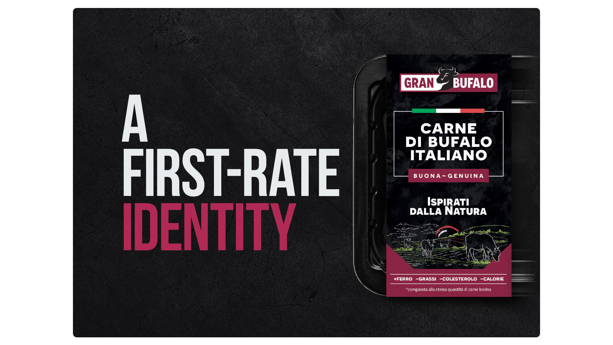
The packaging must communicate the uniqueness and quality of your products, it must make them understandable and attractive for consumers who don’t know them, recognizable for those who have already chosen them once and want to do so again. When we develop the logo, the brand name, the front panel for the launch or restyling of a product, we know that this is what it takes to make it stand out on the shelf.
Lead Generation campaigns; content creation and planning strategies on Google, Facebook and Instagram; content creation and planning of Direct Mail Marketing campaigns; SEM and SEO optimization. Whatever conversion you are looking for, we’re at your side in creating and implementing the funnel necessary to get the results you need, measurable and concrete.
The paradox of shopping online is that anyone can see your products, but no-one can actually touch them before buying. This is why, your e-commerce must show your products off to their very best and in a reliable way, with SEO friendly contents which make you easy to find, appealing images and texts which accompanies the user down the purchasing funnel and distinctive design everywhere. All of this starts from an in-depth study of the competitors, your positioning and your medium- and long-term objectives.
Our advertising campaigns are always a balance of originality, aesthetic impact and extreme clarity: we stay firmly focused on the messages you want to communicate and we transform them into press releases, outdoor billboards, signage, poster, video or radio adverts. Every creativity is developed with a multi-channel perspective so as to optimize the use of your budget.
On the web, you have the opportunity to know the digital reputation of your brand, the behavior of consumers, and the reasons behind that behavior: a real treasure trove of information! For you, we can monitor hashtags, URLs, keywords and help you better understand the market, the target and your competitors’ positioning in order to develop the most functional marketing strategy for your business.
On the web, you have the opportunity to know the digital reputation of your brand, the behavior of consumers, and the reasons behind that behavior: a real treasure trove of information! For you, we can monitor hashtags, URLs, keywords and help you better understand the market, the target and your competitors’ positioning in order to develop the most functional marketing strategy for your business.
Emerging in the in-store arena is a really tough challenge, but with thoughtful design, combined with original and carefully crafted messages and point-of-purchase materials – such as window signs, countertop and floor displays, reglette, leaflets and consumer information folders – you can find yourself at the center of your potential customers’ attention.
Emerging in the in-store arena is a really tough challenge, but with thoughtful design, combined with original and carefully crafted messages and point-of-purchase materials – such as window signs, countertop and floor displays, reglette, leaflets and consumer information folders – you can find yourself at the center of your potential customers’ attention.
With decades of experience in creating campaign concepts, scripts, and storyboards, in choosing locations, in the video direction, photography, and production of commercials and institutional videos, one thing is certain: every brand, project, or product has a story that is worth telling in a spectacular way. After all, videos are the most engaging media ever and remain unmatched for storytelling.
With decades of experience in creating campaign concepts, scripts, and storyboards, in choosing locations, in the video direction, photography, and production of commercials and institutional videos, one thing is certain: every brand, project, or product has a story that is worth telling in a spectacular way. After all, videos are the most engaging media ever and remain unmatched for storytelling.