For over 50 years, Sigill has been a benchmark for those seeking high-quality adhesives and sealants. The brand asked us to help convey its legacy of excellence in a fresh and more distinctive way. The challenge? To express — both textually and visually — its pursuit of the highest standards and its rare, long-standing connection with professionals in the construction industry.
The project began with the definition of a repositioning concept, which we distilled into the payoff “Solutions in hand”. Three words that now communicate the brand’s philosophy internationally — top-tier quality, specific solutions, and no-frills pragmatism — speaking directly to its professional audience.
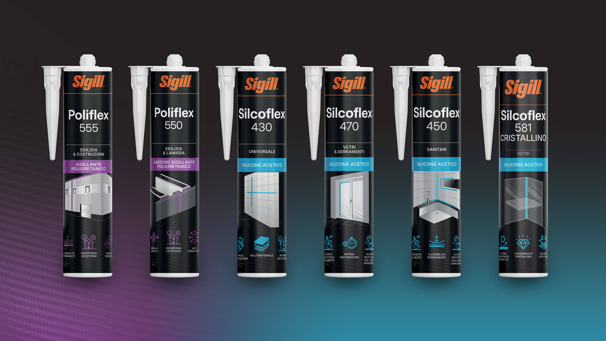
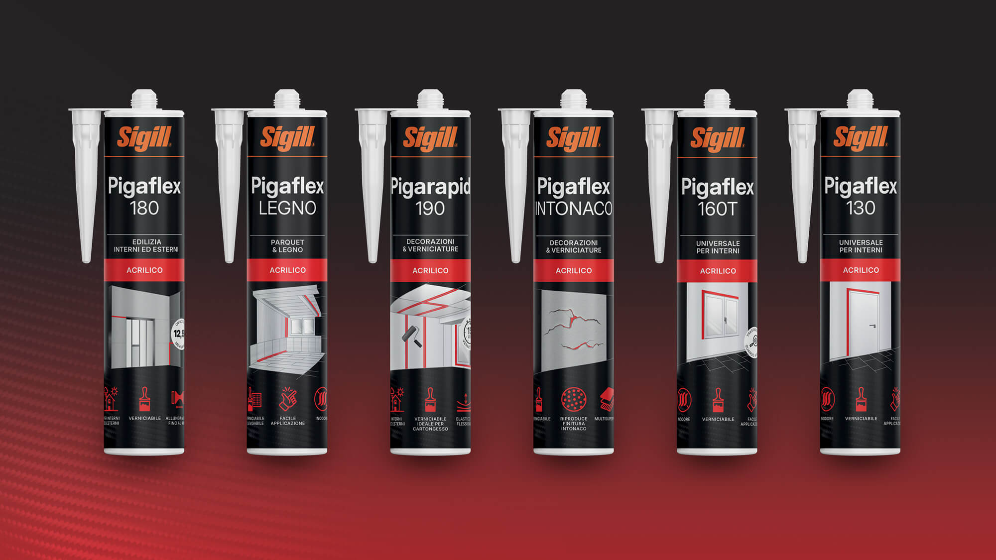
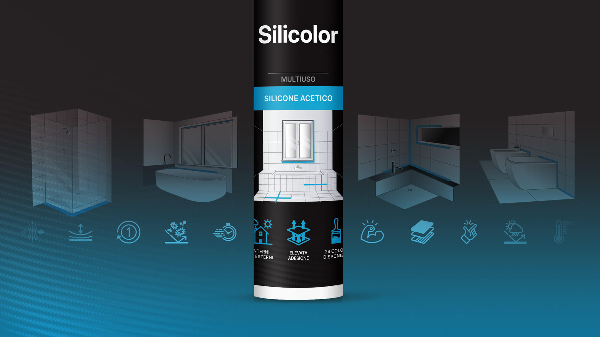
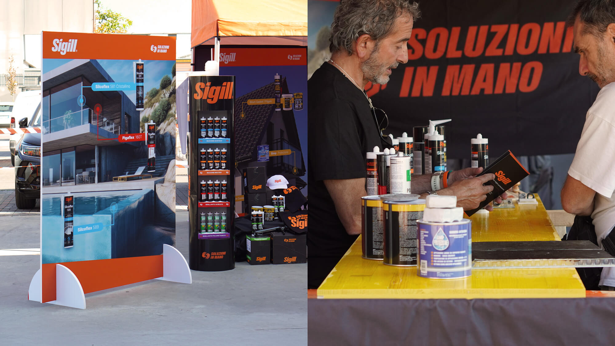
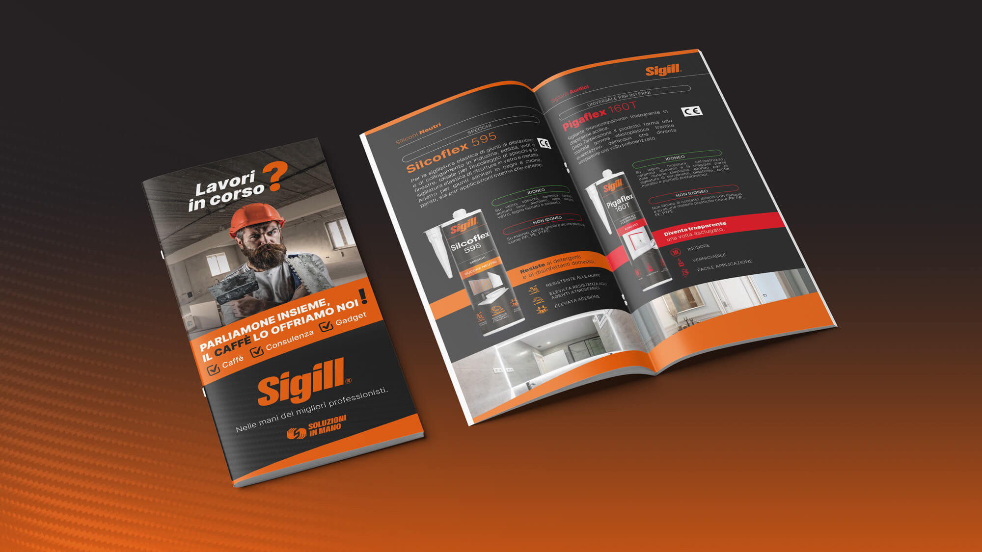
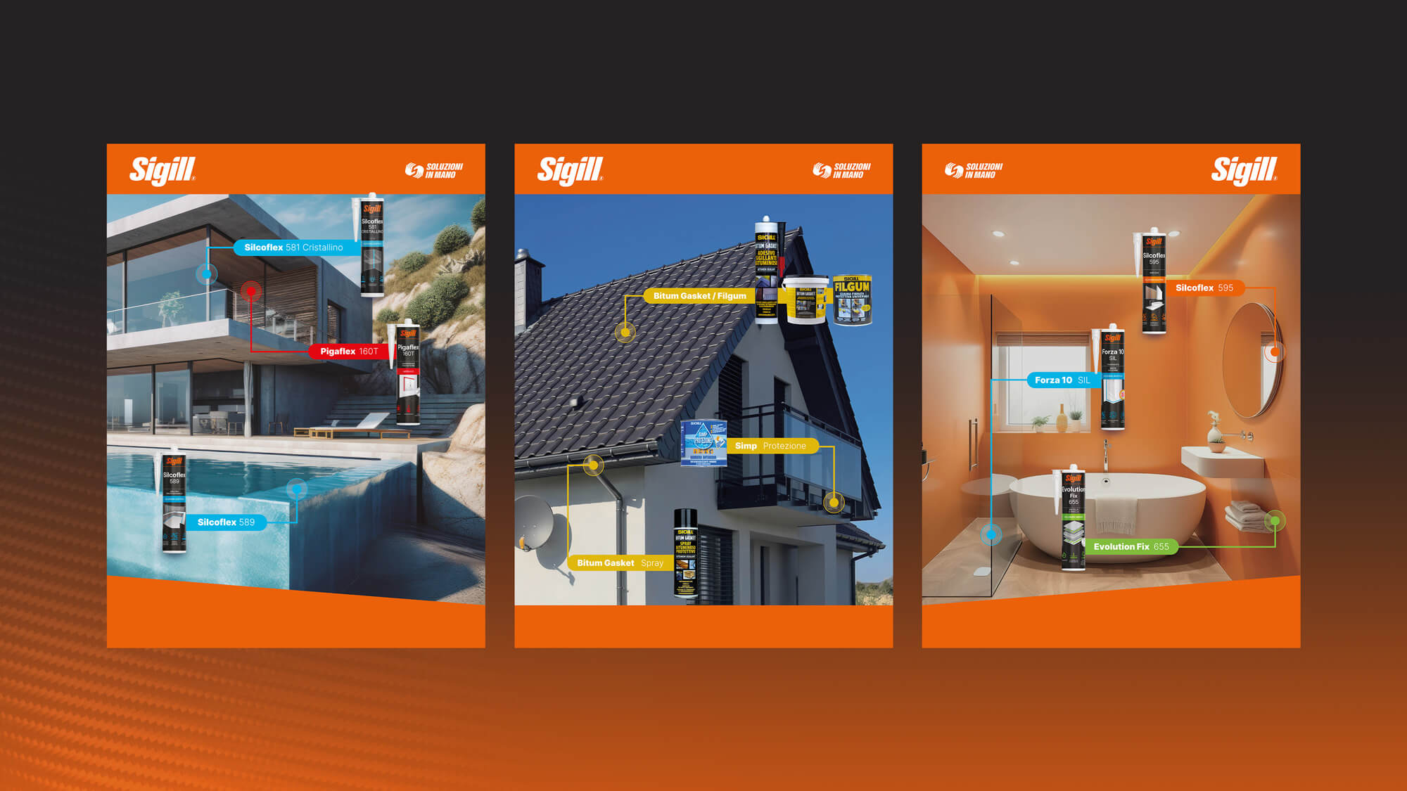
From there, the concept was strategically translated into the packaging design of the entire product line, through a process of rationalization, simplification, and visual impact. We redesigned the labels to create a coherent and functional visual system, featuring technical-style illustrations that clearly communicate the tasks and benefits of each product in a direct, professional language. Every package is designed to “speak” the same language as its user, highlighting product quality and simplifying decision-making.
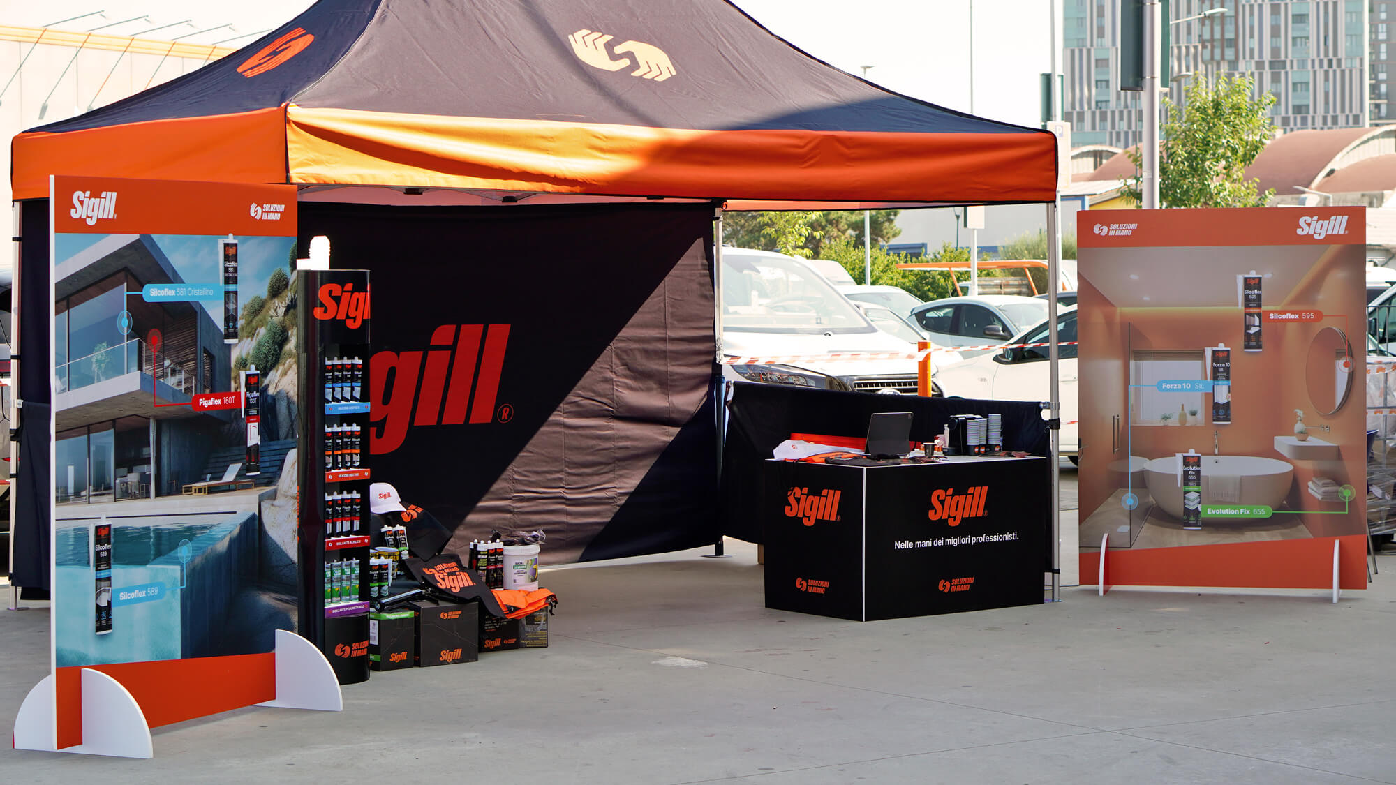
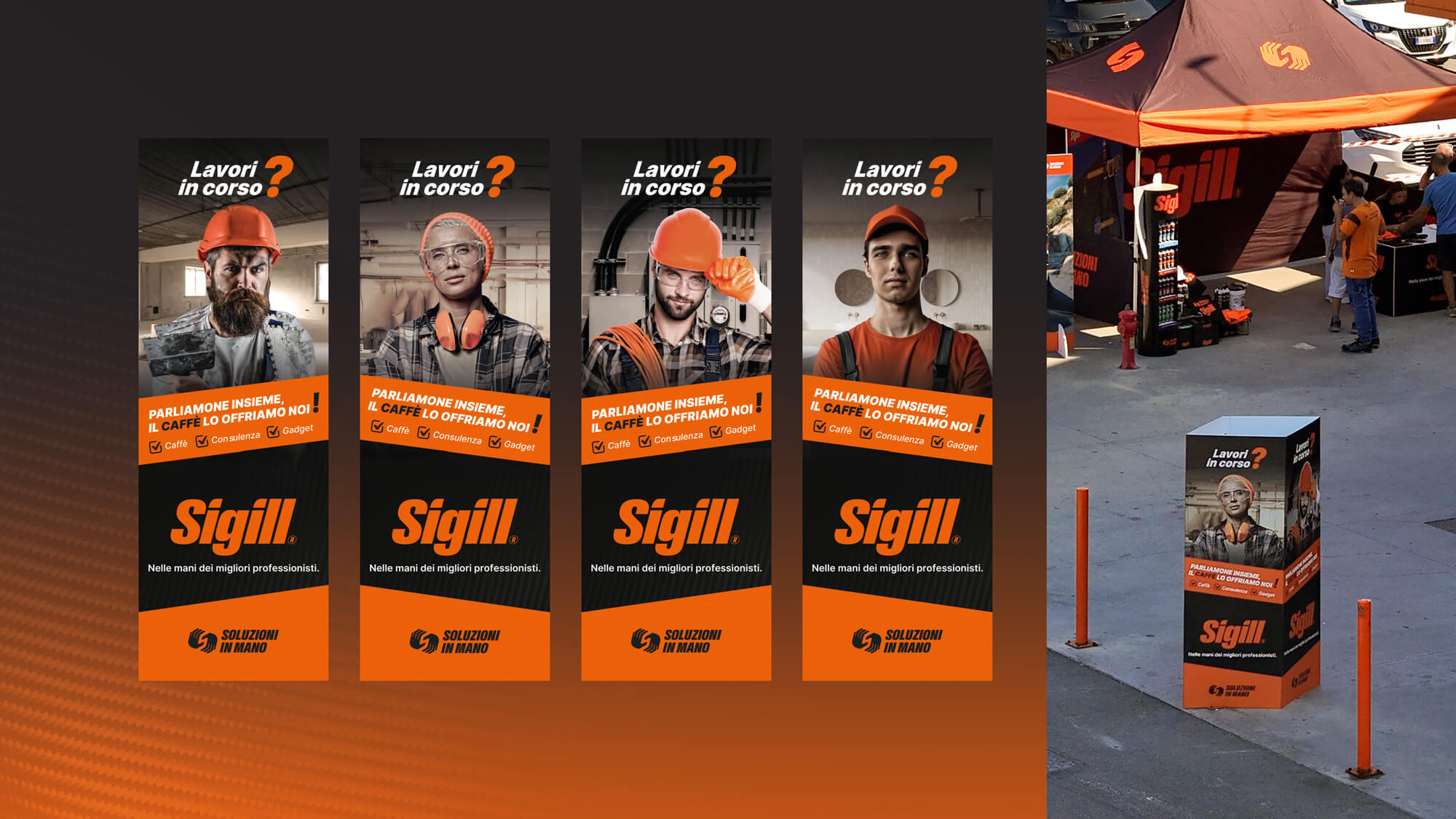
To support the rebranding, we also developed a modular experiential format aimed at strengthening brand awareness, enhancing recognition of the new identity, and deepening the connection with the target audience. With the concept “Work in progress? Let’s talk — coffee’s on us”, and in partnership with Tecnomat Italia, Sigill met its professionals face-to-face in dedicated spaces for dialogue, personalized consulting, and product discovery — all within the informal setting of a pleasant coffee break.